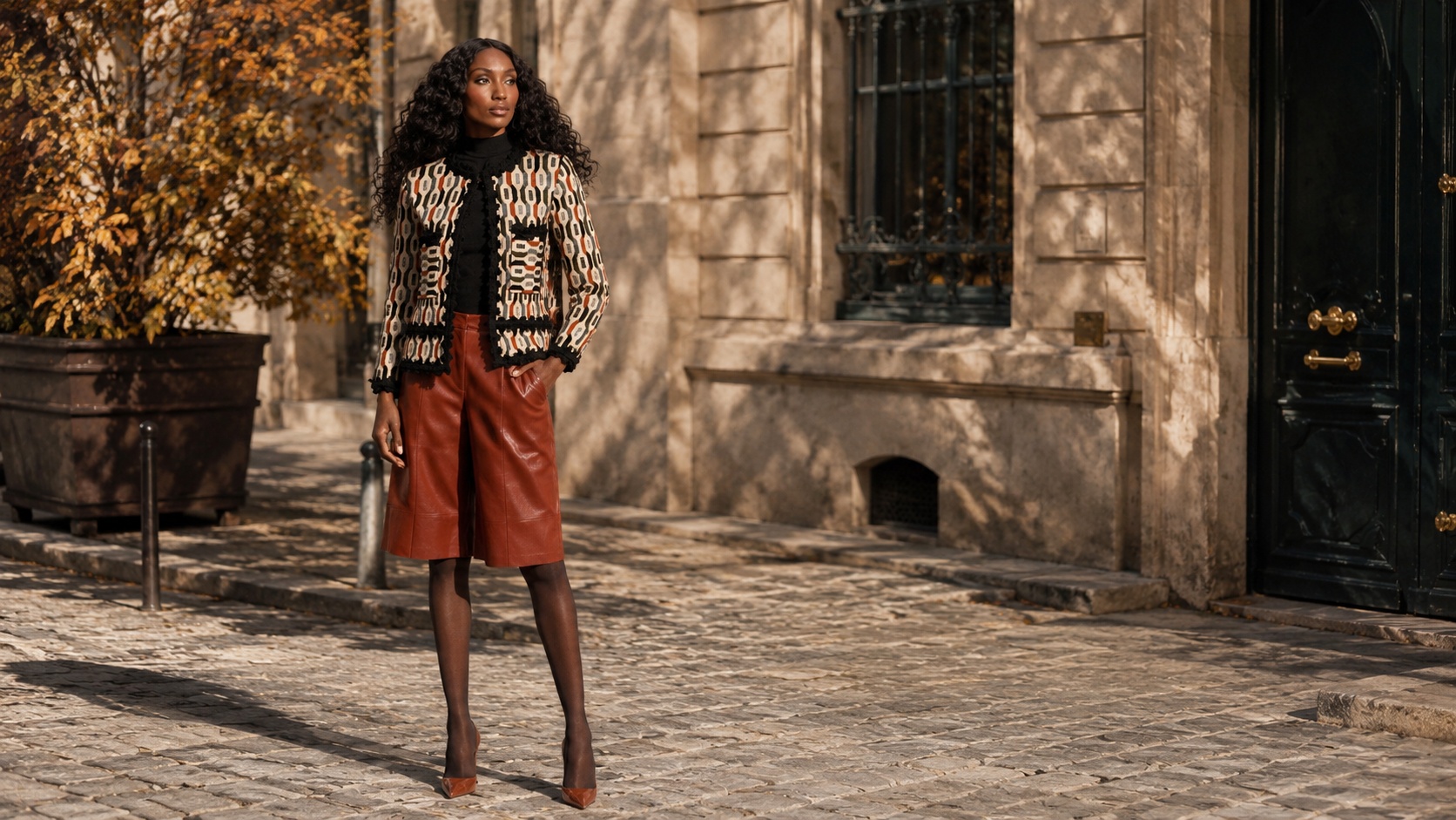
Every season, the fashion industry lands on a color. Not through consensus or committee, but through the accumulated decisions of designers working independently across different cities, different ateliers, different aesthetic vocabularies, arriving at the same answer from completely different directions. When that convergence happens, it means something. For fall/winter 2026, the color is orange. Not one orange, but a family of them: persimmon, rust, burnt orange, pumpkin spice, and the warm terra cottas that sit between all of the above. The runway did not just suggest this palette. It committed to it.
Understanding why the industry landed here, and what these specific tones actually mean in practice, is the difference between following a trend and making a decision. Explore the full knitwear collection at The Extreme Collection USA.
The Tones the Runway Actually Chose
Orange is not one color. It is a spectrum with dramatically different registers at each end, and understanding those registers is what separates the woman who wears the trend intelligently from the woman who simply wears orange.
Persimmon is the richest and most complex of the fall orange family: a deep reddish-orange that carries the depth of burgundy with the warmth of amber. It appeared at Chanel and Christian Dior for fall/winter 2026, which is as close to official validation as a color can get. Persimmon reads as sophisticated rather than loud precisely because its red undertone gives it weight. It is not the orange of a traffic cone. It is the orange of aged lacquer and autumn light on a stone wall.
Burnt orange is the earthier interpretation: warm, muted, closer to terracotta than to the bright end of the spectrum. Where persimmon reads as evening and occasion, burnt orange reads as daytime and considered casualness. It dominated Milan Fashion Week street style for fall/winter 2026, appearing on women who understood that the right orange does not demand attention. It rewards it.
Rust sits between the two: the tone of oxidized metal, of autumn leaves at their deepest point, of a palette that has absorbed both red and brown into something entirely its own. It is the most wearable of the three for women who are cautious about color, because its muted quality allows it to function as a neutral in the context of fall’s darker palette.
Persimmon is a deep reddish-orange with significant red undertones, giving it richness and depth. It reads as the most sophisticated of the three and was seen at Chanel and Dior for fall/winter 2026. Burnt orange is warmer and earthier, closer to terracotta, and reads as more casual and daytime-appropriate. Rust sits between the two: muted, with brown undertones that give it the wearability of a neutral within a dark fall palette. All three belong to the same warm orange family but communicate differently depending on the specific shade chosen.
Why the Industry Chose This Family for Fall
Color trends do not emerge from arbitrariness. They respond to something: a cultural mood, a fatigue with the previous season’s palette, an appetite for warmth or coolness or boldness that the industry reads and responds to before most people have consciously identified it.
The shift toward orange for fall/winter 2026 makes sense in this context. The preceding seasons leaned heavily into cool neutrals, quiet luxury’s beige and off-white palette, and the deliberate restraint of a wardrobe that communicated sophistication through the absence of color rather than its presence. Orange is the correction. It is the industry saying that warmth, richness, and visual presence are no longer concessions to be avoided. They are the point.
The specific tones chosen, persimmon, rust, burnt orange rather than the bright primary orange of previous trend cycles, reflect a sophistication in how the color is being deployed. This is not the orange of maximalism for its own sake. It is orange that has been filtered through the lens of quality and restraint. The same discipline that quieter palettes demanded, but applied to a color that refuses to disappear.
Knitwear is the category where this palette performs most naturally. The texture of a well-made knit carries warm tones differently from a smooth woven fabric, deepening their richness and softening their impact simultaneously. The geometric complexity of a knitted surface distributes color across the piece in a way that makes even a bold palette feel considered rather than overwhelming.
The Scott: The Orange Family in a Single Piece
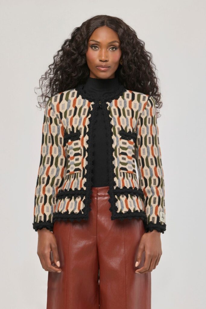
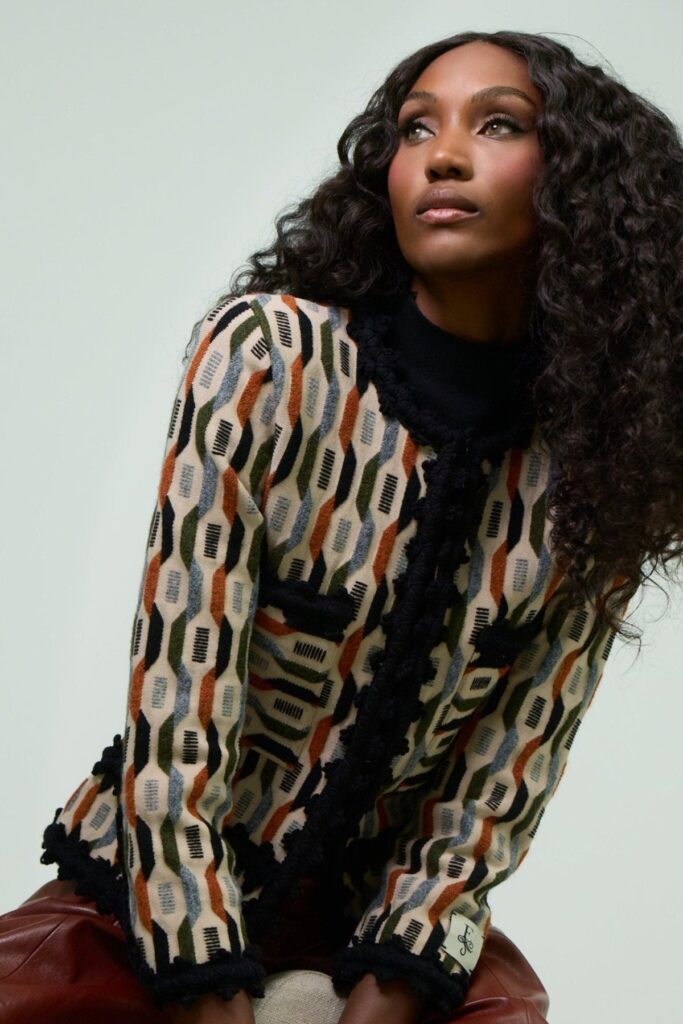
The Scott Printed Jacket does not choose one shade from the fall orange family. It carries the entire spectrum simultaneously. Its geometric multicolored pattern weaves orange, rust, burnt sienna, cream, black and warm brown into a construction that shifts register depending on the light, the setting, and the pieces worn alongside it. In morning light it reads as warm and earthy. Under evening lighting the orange tones deepen toward persimmon. Against a dark foundation it becomes bold. Against neutrals it becomes the neutral itself.
This is the intelligence of a complex print over a solid color: it adapts to the context rather than imposing a single reading on it. The woman wearing the Scott is wearing the season’s color story rather than a single color, which gives her more versatility and more visual interest than any solid orange piece could produce.
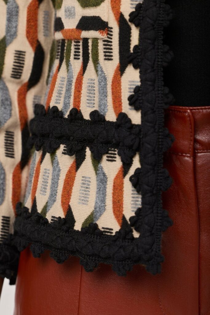
The construction reinforces what the color communicates. Handcrafted ornamental piping traces the buttons, collar, and pockets with the precision of a garment built to be looked at closely. The wool blend provides the warmth and texture that fall requires. The ModaEspaña certification and entirely Spanish production confirm that this is a piece chosen for longevity rather than for the season alone.
The geometric pattern at close range reveals the intricacy of the construction: each color carefully interwoven, the ornamental piping defining every edge with the precision that distinguishes handcrafted work from production at volume.
Burnt orange and rust work best against dark foundations that allow the warm tone to read as the outfit’s focal point. Black, deep navy, and dark charcoal all work beneath or below a burnt orange or rust piece. For a more tonal approach, pairing rust with camel or warm brown creates a monochromatic autumn palette that reads as considered and sophisticated. Avoid pairing warm oranges with cool tones like grey or pale blue, which create a clash rather than a complement. In knitwear specifically, the texture of the fabric softens the color’s impact and makes it easier to wear for women who are cautious about bold tones.
How to Wear the Orange Family This Season
The orange family rewards a specific approach to the rest of the outfit. Because warm orange tones already carry significant visual weight, everything surrounding them should do less rather than more. A dark foundation beneath and below the piece allows the orange to read as the deliberate choice it is, rather than competing with other elements for the same attention.
For the Scott specifically, a black turtleneck and dark tailored trousers create the cleanest possible foundation. The jacket’s multicolored pattern provides all the visual complexity the outfit needs. Pointed-toe heels in black or camel reinforce the considered register without introducing a competing element. For a more relaxed approach, straight-leg dark denim beneath the Scott shifts the combination toward weekend territory without diminishing the jacket’s presence.
Accessories follow the same principle: minimal and tonal. A structured leather bag in cognac or camel resonates with the warm orange palette without competing with it. Gold jewelry over silver: the warm metal family aligns with the warm color family. Nothing that introduces a cool or bright note the palette would have to reconcile.
Yes. Orange is one of the most validated colors for fall/winter 2026, appearing across the Chanel and Dior collections as well as dominating Milan Fashion Week street style. The specific tones that work best for fall are persimmon, burnt orange, and rust rather than bright primary orange, because their warm earth undertones align naturally with the season’s palette. In knitwear particularly, the texture of the fabric distributes the warm tone across the piece in a way that reads as sophisticated rather than bold.
The Fall/Winter 2026 Collection
The Scott is the first expression of The Extreme Collection USA’s fall/winter 2026 direction. The full collection launches September 8th, with new pieces that continue the season’s conversation around warmth, richness, and the particular authority of a wardrobe that chooses quality over volume. The orange family is one thread in that conversation. It is not the only one.
For the full range of knitwear at The Extreme Collection USA, explore the knitwear collection. For the broader blazer wardrobe that the fall/winter season calls for, the full blazers collection covers the structured tailoring that the season’s occasions require.